Large graphic design agencies
Soap Creative
How did the company begin? Soap Creative began with 3 guys sharing the corner of an office in 2002 with a 160GB networked HD. Since then it has grown into a company of over 50 people spread across two countries. With L.A. opening up in 2008 to further commit to their growing U.S. client base.
How many staff members are employed there? There is over 50 staff members employed at Soap Creative.
What do they specialise in? Soap Creative specialise in the designing and building of websites and games, content social media, widgets, electronic direct mail, standard and rich media, delivery innovative, high creative ad strategy-focused campaigns.
What sets them apart from other agencies/companies? Soap Creative have an interesting way of setting themselves apart fro other design agencies. Each member has a soap-o-hero alter ego, which they get to choose and illustrate and place them on their business card. They say this is great for the client meetings and pitches as it creates a ‘tribe’ and creates unity among the staff. The culture of the soap-o-hero is extended throughout the entire office.
What do you think their strengths and weaknesses as a business are? Soap Creative has much strength; they are extremely good at designing and building games and 3D images. I believe it takes a lot of skill and time to be able to build video games and Soap Creative are very successful at that. I don’t know that this company has many weaknesses, if any at all. They are a very successful agency.
Small graphic design agencies
White Space
How did the company begin? We have been operating since 2003 and take pride in our knowledge and experience, and we want you to benefit from it! We can supply your logo design Brisbane, business cards Brisbane, web design Brisbane, brochure printing, web development, every single marketing material that displays your business brand.
How many staff members are employed there? 2-3 employees
What do they specialise in? Logo design, business cards, stationary, brochures, marketing collateral, family portraits, corporate headshots, web design, photography and print.
What sets them apart from other agencies/companies? When they design your logo you will receive, FREE :-
- 1000 free business cards on quality card - not thin and flimsy - double sided, full colour, matt cello finish, 360 gsm, and professional quality product!
- Electronic stationery suite including letterhead and email signature
What do you think their strengths and weaknesses as a business are? The strengths for this business are that they offer ‘freebies’ and everybody loves freebies. I think they offer FREE business cards and stationary so that it gets their name out there. I guess the weakness is that they aren’t making as much money when they hand out FREE stuff, because they are not getting any money from the stuff they give away.
Large publishing companies
Harper Collins
How did the company begin? Unknown
How many staff members are employed there? Unknown
What do they specialise in? They’re a major publishing company so they publish books, etc. Permissions, bookseller and retailer ordering, educator and librarian resources, and subsidiary rights.
What sets them apart from other agencies/companies? Harper Collins is a major publishing company; they are very well sought after.
What do you think their strengths and weaknesses as a business are? Because they are a very sought after company, they are very popular and wealthy. They are a strong business; they are very specific with the books they choose to publish, which is guess could also be a weakness because they aren’t getting as much business. Though a company like this doesn’t need too much business when they are already wealthy and considered high class as a publishing house.
Small publishing companies
Random House
How did the company begin? Random House was founded by Bennett Cerf and Donald Klopfer in 1927, two years after they purchased the Modern Library, which published reprints of classic literature. Since then Random House has acquired a number of publishing companies and been bought by others in turn -- most recently by Bertelsmann.
How many staff members are employed there? Unknown
What do they specialise in? Publishing books, etc.
What sets them apart from other agencies/companies? Random House is a publishing house, it
What do you think their strengths and weaknesses as a business are? This company is a well sought after company and is considered a high class/trustworthy company when it comes to publishing, and this is strength. Their weakness is most likely the fact that they only do publishing, and not any other services. But I guess that’s what comes with being a publishing house.
Freelancers
Sprowt Graphic Design
How did the company begin? Amber Hopwood started her small freelance business by doing graphic design through freelance. She has 6 years of experience in the industry.
How many staff members are employed there? There is only one employee as it’s a freelance graphic design job.
What do they specialise in? Sprowt specialises in corporate identity and branding services.
What sets them apart from other agencies/companies? Sprowt sets itself apart from other companies/agencies because it is a freelance company, which is only run by one person. Amber Hopwood is the founder/creator of this freelance business, putting herself out there in a very professional manner so that she is perceived as ‘reliable, successful and professional’ to her clients. Sprowt’s work is clean, tight, aesthetically pleasing and well presented.
What do you think their strengths and weaknesses as a business are? I think Sprowt’s strengths are that she has the ability to create aesthetically pleasing designs for her clients, as a freelancer I think she is very successful. Her weaknesses may be that she isn’t really well known
Online-based design business
Salsa Internet
How did the company begin? Salsa Internet was formed in 2003 by a group of 3 web development professionals who were sick of seeing companies, both small and large, being overcharges for web solutions and often poorly serviced by their web development suppliers.
How many staff members are employed there? 16
What do they specialise in? They consider themselves to be a full service web agency. Web design, development and e-commerce, and online strategy.
What sets them apart from other agencies/companies? This company is different from other companies because there business is about helping out their clients at a reasonable cost, giving great service.
What do you think their strengths and weaknesses as a business are? I think the fact that they want to help their clients achieve their goals and solve their client’s problems is strength, as other companies may only care about the money side of things. Some agencies might do a crappy job and still have to be paid for it, whereas Salsa is here to provide great service, which comes at a great price.
Web design businesses offering graphic design as a secondary skill
Diop Design
How did the company begin? Unknown
How many staff members are employed there? Unknown
What do they specialise in? Website design, website upgrades, flash animation design, online shops, website design brief, content management, domain names/hosting. Graphic design services: logo design, logo design brief, stationary, flyers, and posters. ‘At Diop Design we love small businesses - the range and variety is great because it keeps us creatively challenged. Every new client has a unique selling point that makes them successful and we enjoy relating that usp in our designs and strategies.’
What sets them apart from other agencies/companies? They mainly focus on web design and flash animation, but also supply graphic design services.
What do you think their strengths and weaknesses as a business are? I think all their services count as strengths, they are a small business that focus on web design but also have the ability to do graphic design jobs.
Overview of the Trade Practices Act
The Trade Practices Act aims to enhance the welfare of Australians by promoting competition and fair trading and providing for consumer protection.
The Act deals with almost all aspects of the marketplace: the relationships among suppliers, wholesalers, retailers, competitors and customers. It covers anti-competitive conduct, unfair market practices, industry codes, mergers and acquisitions of companies, product safety, product labeling, price monitoring, and the regulation of industries such as telecommunications, gas, electricity and airports.


My Proposal

 Group Proposal


An assessment was given to us as a real world design challenge and we as a class were given 4 different jobs:
* Home Tavern - TV Promotions
* Gibbs Design - New website
* TAFE - Promotional posters
* Fitness 4 Women Gym - Corporate Identity Rebrand
We each had to choose one of the jobs listed above, and in a group combine our skills and knowledge to come up with promotional material for our chosen business. I chose Fitness 4 Women Gym as did Skye and Elise.
As a group our job was to design a corporate identity rebrand for Fitness 4 Women. Before we contacted Sharon Forde, owner of Fitness 4 Women, Skye, Elise and myself sat down to discuss what we were going to do. We talked about the following:
- What colours would she like/dislike for her business identity?
- What promotional materials would she like done?
- If so will images be supplied?
- Will the rebrand package just be a business name or include and logo?
We got a little overwhelmed with the idea and exactly what we were going to do for this job. We decided to sit down with Sharon Forde to discuss what she wanted. This made it easier for us to get our head around the job as the client knew exactly what she wanted and where she would like to take the business. Sharon didn’t want her business to resemble the previously owned business ‘Contours’ in the slightest, so we then knew what we couldn’t do and went from there.
The possible promotional material that Sharon asked for was:
- Identity/Rebrand
- Business cards (for owner plus other staff members)/Stationary (letterheads, etc.)
- Mailbox Flyers (quarterly)
- Motivational Posters
- Pull-down poster
- 12 day pass card
- Promotional clothing and packages (towels, hats, t-shirts, backpacks, nail files, etc.)
- Stickers for windows/car
- Sign for the shop front
We decided that we couldn’t complete all these jobs in the short amount of time we had to do the initial job, so we decided we would only do the corporate identity rebrand for now and possibly discuss other jobs to be completed in the future. Once we had given Sharon Forde our proposal and received our signed copy, we then went away and each designed a few logos that would be appropriate for the business before each choosing one of our favourites. We then presented three logos to the client for feedback. The client chose the design that had been done by Elise, which I thought was a smart option as I believe Elise’s design was strongest out of the three.
Throughout all the meeting with the client all of the group behaved in a professional manner and dressed appropriate for meeting.
I believe we firm enough with the client in suggesting that we just work on a corporate identity and not everything else she wanted as it was a lot of work to undertake in such a short amount of time. The client was very friendly and acceptable to the advice and information we gave her.
Before we started anything, I was slightly intimidated as being a student I hoped it wouldn’t be too difficult to sit down and talk with Sharon, and whether she would take us seriously or believe we knew what we were doing. Though I was much more relaxed and calm after meeting with Sharon, alongside Elise and Skye. Sharon is an easygoing person, she is friendly and works in an environment that is surrounded by people every day.
At first I didn’t really involve myself in much conversation, apart from making my own opinion, as I wanted to sit back and take in the whole meeting while thinking about was wanted from the client, and also because I was a bit unsure of what to say.
Having the opportunity to experience this kind of work was very interesting, although I have worked with clients before, this time was very different. In a way I think it was easier because previous clients I have worked with paid for the job, whereas Sharon Forde wasn’t. Though I think things would have been very different if there was a cost involved.


Aggressive - means to attack, or make invasions. In the book 'The Time Machine' there are aggressive creatures that attack and invade the village people in groups and take them to eat later. I wanted my book cover to have an evil feel, to coincide with aggressiveness, thus why i used the colour red behind a silhouette of a face. The face represents the evil underground creatures in the story 'The Time Machine'. I didn't want the type to get confused with the red stripes so I kept it bold and large so its easy to read. When designing this book cover my main focus was to keep it simple, clear and not 'over board' or crowded. I believe the red on black demonstrates anger and aggression, which mainly relates to the underground creatures in the story. Though it seemed simple to use images of these creatures, i wanted to do something different, thus why i used a silhouette instead of an actual image/photograph. I think the end result of this particular design came up well.
Passive - For this design I wanted a mellow yet attractive and futuristic image, which i believe i found. Passive means to be inactive, and i strongly believe this image demonstrates just that with the man standing in the street. The brightness of the light casts a large shadow behind the man, which i think makes the image intense. I also thought the brightness of this light and the smaller lights surrounding it, represented a time travel theme, which is exactly what i was going for. I believe this image demonstrates passiveness. I wanted the type to have a futuristic theme so i kept it bold and clear, which is easy to read. I made the type white because, to me, its a passive colour and i thought it worked well with the image. I am very happy with the end result of this book cover design!
Modern - Designing a book cover for this theme was all but too simple. I used a modern type image of a few cogs to represent the time travel feel as the 'time machine' is made up of millions of little bolts and cogs. I believe this worked really well as i wanted to keep this book cover simple and clear. Modern is 'new age' which i thought this image portrayed perfectly, along with the type i chose. I kept the type clear, simple and very modern. I am happy with the end result of this book cover, i strongly believe it works well.
Future - This particular book cover design is one of my favorites. I found the image on Google before making a few of my own changes. The many futuristic buildings and numerous moons/planets give it a futuristic feel. The man standing on top of the building represents the 'time traveler' in the story where the large glowing ball above him represents the time machine. I wanted the type to be simple yet strong, so used a particular typeface that would portray this, using the colour white as it stood out the most and worked well with the large glowing ball. I am very happy with the end result of this book cover design, its aesthetically pleasing, very attractive and i believe it is an awesome design for a book cover.
Dynamic - means moving or in motion so when designing this book cover i wanted an image that had movement. I believe the image i have chosen demonstrates movement with the numbers flying around the clock, which represents time travel and time movement. I added numerous numbers to make them look as though they were flying around the clock. The clock looks as though it is magic, with its bright glowing rays and swirls. Adding the numbers gave it a more of a time travel like feel to the already dynamic image. The type was kept simple, clear and easy to read, using a typeface similar to those used in my other book cover designs. I am happy with the end result of this design.
Classic - for this book cover i wanted to keep the whole design classic, using an image that came across as 'classic' and to me the man in the long black coat and hat, accompanied by a walking stick, portrayed him as coming from a classic era. I believe this image is perfect for this theme as it looks as though the man is about to walk into the future, which is represented here as the large clock. The typeface i used is simple, clear yet bold and classic, which i thought worked quite well with the whole design. I really like this book cover design, i am very happy with the end result.
Grungy - means dirty, rough, rugged and worn out. I thought this image really suited the grungy feel to the story with the giants cogs and bolts to represent the time machine. The two people standing on the giant cog represent the underground creatures in the story with the glow of flame that represents the fiery depths of the underground world where these creatures live. To be able to interpret this book cover design you really have to know the story. I am happy with this design and believe its aesthetically pleasing and demonstrates the grunge of the story.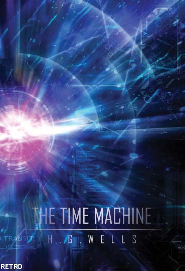
Retro - means 'out there' and very decorative with lots of geometric shapes, fluro or bright colors. This image worked well with my design concept as the bright circles and planet like shapes represented futuristic elements suited to the 'time machine' theme. The layers of circles reminded me of 'years' or 'time' which is what is being traveled. The colors in this design, to me, represent those of a retro feel. The type is strong, simple and clear, easy to read and works well with the image. I am very happy with the end result!
How do you set the background colour of your website?
The background-color property describes the background color of elements.
The element contains all the content of an HTML document. Thus, to change the background color of an entire page, the background-color property should be applied to the element.
You can also apply background colors to other elements including headlines and text. In the example below, different background colors are applied to elements.
With CSS, a color is most often specified by:
- HEX value - like "#ff0000"
- an RGB value - like "rgb(255,0,0)"
- a color name - like "red"
How do you underline text?
You can underline the text by typing in the following example,
are underlined headlines,
What is a pseudo-class?
A pseudo-class allows you to take into account different conditions or events when defining a property for an HTML tag.
How can you style all links on your website with a few lines of code?
Using style sheets and linking them with the content, this allows you to change the style of content without having to change each piece of content individually.What is the Box Model?
The box model in CSS describes the boxes which are being generated for HTML-elements. The box model also contains detailed options regarding adjusting margin, border, padding and content for each element.
What are the two ways we can increase space around text?
With the width-property, you can define a certain width of an element.
div.box {
 width: 200px;
 border: 1px solid black;
 background: orange;

}
The default indenting is 0, if you want to indent your text, you would add a positive length or percentage. If you wanted to outdent your text, you would add a negative length or percentage. For example:
blockquote { text-indent: 1em; } li { text-indent: -1em; }
Wagga Wagga Accommodation
Wagga Wagga offers a range of hotels and inns for your accommodation. There is plenty to choose from that will cater to your needs, throughout your stay.
The Lawson Motor Inn
Kitchenette, large bathroom and shower, Queen & King sized beds, large elegant rooms with high quality furnishings & fittings, covered balcony with views into the Murrumbidgee River from the 1st floor, and a covered veranda opening onto courtyard on the ground floor.
Carlyle
Carlyle Suites and Apartments offer the ultimate in comfort for Wagga Wagga accommodation. Understated sophistication and attention to detail is reflected in all our rooms. Our property boasts 21 studio suites and self contained apartments reflecting a contemporary and sophisticated style, meeting facilities for up to 8 delegates, complimentary broadband access in all rooms, and a clean non-smoking atmosphere.
The Heritage Motor Inn
The Heritage Motor Inn is located just metres from the Wagga Base Hospital, close to Calvary Hospital and the main shopping centre. This central location makes the Heritage a good choice for both corporate visitors to Wagga and leisure visitors here to see the many sites and attractions Wagga Wagga and the surrounding areas of Junee, Coolamon, The Rock and Temora have to offer.
We offer modern luxury rooms, all with queen size beds, kitchenettes, iron and ironing board, tea and coffee making facilities, mini bar and meals to rooms, AUSTAR (free), Broadband Internet access: Wireless/Cable.
The Wagga Wagga Heritage Motor Inn is a family operated 22 room 4 Star Motel. We believe our friendly service and clean rooms will make you feel right at home.
We also have serviced apartments available in a security complex, near theatres and main street shopping and business.
All Seasons Pavilion Hotel
All Seasons Pavilion Hotel is located in the centre of Wagga Wagga. For business or pleasure you'll find all your accommodation, conferencing and dining requirements under our unique 35m canopy roof.
With 45 rooms, a restaurant, café, bar, lounge areas, an all weather deck and a private conference room, we have the facilities to ensure your next visit to Wagga is everything you hoped for.
We also provide a complimentary high-speed internet business centre and offer 5 Austar channels to each room.
Meet, Greet, Eat & Sleep... well, at All Seasons Pavilion Hotel Wagga Wagga, excellence in service and hospitality.


Design & Architecture/ Graphic Design - Perth CBD, Inner & Western Suburbs. http://www.seek.com.au/Job/graphic-designer/in/perth-cbd-inner-western-suburbs/20227367.
- What are the mandatory portfolio requirements of the job? Tertiary qualification in graphic design, Demonstrated prepress experience, Advanced skills using Adobe Creative Suite (PC),
- What skills/experience does the job require? Ability to follow branding guidelines, Minimum of 1-2 years commercial graphic design experience, the ability to print.
- What portfolio pieces do you have that would be appropriate for this position? Posters/designs, brochures, magazine covers/spreads, book covers, and other advertising material that i have completed in the past.
- Would a digital or print portfolio be best suited for this position? Both? For this position i think a printed portfolio would be best suited as the job involves the designing and printing of brochures, etc, stationary material. I believe a printed portfolio would be best because it shows the employer that the job seeker knows what they are doing, when designing and printing. Printed work is easily accessible compared to digital work, although an online portfolio would also be a useful idea because it demonstrates skills in web design and maintenance.

Design & Architecture/ Graphic Design - Sydney, North Shore & Northern Beaches, $40 - $45 p/hr. http://www.seek.com.au/Job/graphic-designer-corporate-design-work/in/sydney-north-shore-northern-beaches/20236179
- What are the mandatory portfolio requirements of the job? Print designer who has experience with Corporate Communications.
- What skills/experience does the job require? Experience with Corporate Communications, This role is to rework internal documents and redesign some organization charts and information. You need to be able to design for Corporate Communication with an a company spin.
- What portfolio pieces do you have that would be appropriate for this position? I have various corporate ID's, logos, etc, that may be appropriate for this position.
- Would a digital or print portfolio be best suited for this position? Both? For this position i think both printed and digital portfolios would be suited for this position.

Design & Architecture/Illustration and Motion Designer - Sydney, CBD, Inner West & Eastern Suburbs. http://www.seek.com.au/Job/illustrator-motion-designer/in/sydney-cbd-inner-west-eastern-suburbs/20235801
- What are the mandatory portfolio requirements of the job? Competent in Adobe Photoshop, After-Effects and Illustrator.
- What skills/experience does the job require? At least 2 years experience working in a production based environment. Tertiary skills in design or visual communications, and experienced in compositing live video with graphical animation.
- What portfolio pieces do you have that would be appropriate for this position? I have many illustrations and projects involving illustration that have been completed for class tasks, and others i completed on my own. I think this position would be suitable for me as i am very fond of illustration and have completed a few animations of my own.
- Would a digital or print portfolio be best suited for this position? Both? I think both a printed and digital portfolio would be best suited for this position as it requires you to show illustration and animation.