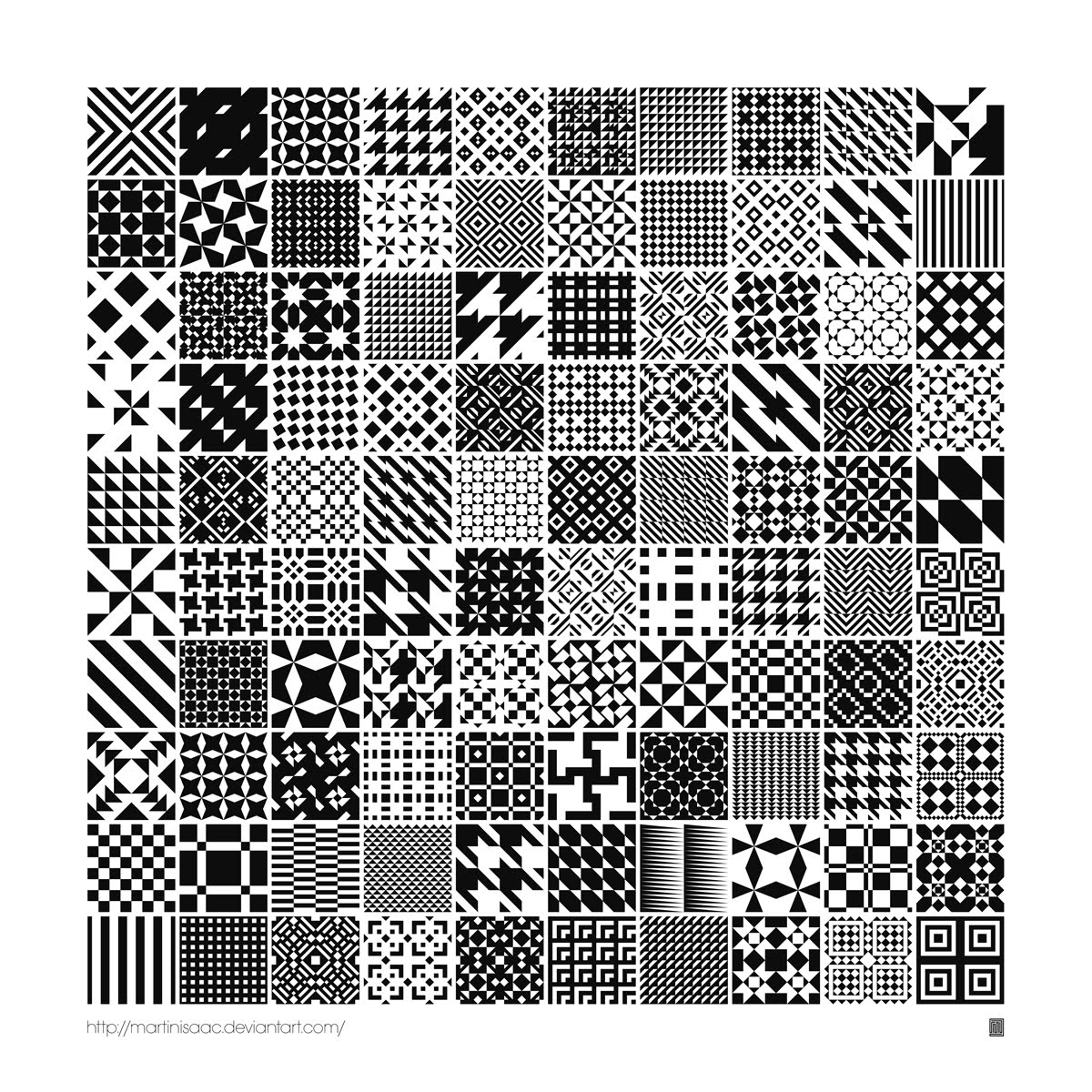
We were given a task to create our own tesselation pattern and repeat it a few times to create a bigger pattern. Here are my final results.....computer based!

The business that I was given was Full Bloom Florist, and the accompanying Pantone colour is Pantone 240. Pantone 240 is a hot pink kind of colour, like a magenta, which is appealing to a lot of women, making my target audience women from 18 to 50 years of age. I wanted my business to look clear and simple but also professional because professional is trustworthy.
I believe that the colour I was given gives the website a sense of warmth as to me it’s a calming type of colour. I believe this will keep the customer/target audience calm when searching for the information they need.
I chose a tint from the Pantone I was given, this was a much lighter pink which is suited well to Pantone 240. Two other colours I used were a simple black and the other white. I wanted as least colours as possible so the website wasn’t hard to look at.
I used the Pantone 240 in my logo and also a few sections of my web skin, but not so much that the whole webpage was Pantone 240. Too much of the same colour would be boring and not very attractive to the target audience. The colours I have used were easy to work with and I think they are very attractive to the main target audience.
I wanted to keep the imagery as simple as I could, thus only using one type of image, a flower. I didn’t want to cover the whole web skin with the flower because I didn’t want it to look trashy and off putting to the target audience, also because it would look too feminine with so many flowers, even though the business is a florist.
Because my Pantone colour was a dark pink, there wasn’t much I could do with it in order to target men whom are interested in flowers. Although nine times out of ten, its women who look to florists. But with the other colours I had used, the web page is still easy to look at and navigate in order to get the information needed. Even for a male who wants to buy flowers for his wife or mother. The Pantone still works as a male customer may look for pink when searching for flowers as a gift to a loved one.
One page I decided to include is called “Flowers” and this page shows the list of specials. Each image of the specials gives the customer an idea of what’s available for them to buy. Though here I have only used one image of the flower basket just to give an example.
I designed my logo the way I did because it’s simple, clear and professional. Professional is trustworthy, and my motif is trustworthy because it’s simple and easy to read. I like the idea of using the ‘L’ in ‘bloom’ as a stem of a flower; it gives the logo a little bit of character. I put my logo on every web page through the website so the target audience would become familiar with the logo (motif), making it easier for them to look for in the future if need be. I also kept each page as similar to the other, making it more professional and giving it repetition and familiarity.
I chose to use as least typefaces as I could so reading the website would be easy and understandable. I used a simple san serif for the logo as well as the rest of the text on the website, keeping it as simple as possible. I used a serif for the title of each web page just to make it a little bit fancy.
The typefaces I used are Myriad Pro for the body text, Myriad Pro Bold for the logo and panel headings, and Harlow Solid Italic for the title headings of each page.
I set out my web page the way I did so it’s easy to navigate and nothing becomes too complicated to find. I put side panels for each page of the site, making information easy to find and read. I decided to keep all the information set in the middle of the webpage so it’s easy to find, it’s just out there, right in front of the viewer.
I believe the website I have designed meets the goals that I have set for myself to achieve. I believe it looks attractive, simple, clear and professional. I am confident that it attracts the target audience of women from 18 to 50 years of age. The web skin isn’t complicated and everything is easy to find, it looks easy to navigate.I believe my overall design is well done, I enjoyed designing my webpage! I hope u enjoy looking at it! :)

1. Celtic art has been around for many years and is still around today, not only in Australia but all over the world. What might seem like an old traditional design to the Celts is a new intriguing idea to an artist. Celtic art can be seen in our world today, for example in jewellery, tattoos, materials in clothing, and even stained glass windows. Celtic art has been an inspiration to me as I love tattoo design. It’s interesting to see that such a remarkable piece of art has come this far in time.
2. Aboriginal art is more than just paint splatters on a piece of material or wood. To the indigenous people it has meaning; it can be about their lifestyle, their everyday life, beliefs, customs or ceremonies. A piece of art of an animal for example means more than just a picture of an animal, it can be their creation being, associated with their mythology. A few added symbols can turn their painting into a story. Just like modern art, Australian aboriginal art was traditionally either naturalistic of abstract. Naturalistic art means pictures, paintings and engravings about animals, or people, whereas abstract art consists of dots, lines, circles, and other shapes and symbols that each have meaning. The symbols may not be very understandable to you or me (non-aboriginal) but each tribe knew their symbols like we Australians know the alphabet. They could tell the story by just looking at a piece of abstract art, that’s why it’s so important to them. Aboriginal art is one of the ways by which the Aborigines expressed their culture and histories. Art was a way to pass down traditions and stories of the Dreamtime (creation).
3. Most designers are highly impressed by M.C. Escher’s work, as it is highly detailed. Escher takes up all his time to do his art, completely absorbing his thoughts. He used his art to communicate, instead of writing down his thoughts; he presented them as visual images. Escher spent many years presenting and studying graphic art; the craft became second nature to him. People loved his highly detailed work because he spent so much time coming up with new ideas and creating pieces, which he then presented to the public. People were astonished at the fine detail he used.
4. From the early 19th century to our day in age, art and culture has changed dramatically, it’s very interesting to see the changes through different pieces of art from different time periods. From prehistoric ages such as cave and rock paintings, those similar to the indigenous forms of art; to the renaissance and modern to post modern art. Renaissance art began the key principles of perspective and detail, which made the movements more lifelike and exciting than previous art from the Middle Ages. These new principles gave paintings a new depth and realism never seen before, thus giving artists new inspiration. Arts and cultures are very interesting as you can see the differences in artwork and how languages were translated or communicated through imagery. Cave men might not have been able to speak English, but they left messages behind in their cave paintings. Stories from their time period that is now classed as history.
5. Looking backwards to our history when trying to engage in design solutions for modern society is beneficial as new ideas are found that may have been previously hidden. These new ideas are taken and changed, improved by other artists. Looking back at the history of art inspires us to further our knowledge in creating our own pieces. If someone that wishes to pursue their career as an artist may look back at history to give them an idea of what’s in store. I love designing tattoos so I really look into Celtic art; it inspires me to always want to draw more and more.
6. Ancient art has affected my life because it has given me a lot of ideas. It has influenced me to learn more about the different pieces of art from history and it has also inspired me to do my own. I love everything about art, the history behind it as well as the practical. Learning about art from different ages is very interesting as you can see the different techniques that artists have used, and influences me to try them. One type of art I like to look at is Celtic art; it interests me a lot because I draw a lot of my own Celtic pieces. I love tattoo design and am in the process of designing my own tattoo, so Celtic art is something I occasionally look towards to get different ideas.
7. I can only think of one cultural influence that has happened in my life n that’s the art of the Celts. Celtic art is very fascinating to me as I love looking at all the diverse patterns and how each connects with the other. I enjoy tattoo design, especially Celtic design. To me it’s a simple yet complex form of art that I love doing. Once I get started on a piece I cannot stop until it is finished, improving sections as I go. I can be so wrapped in designing that I don’t even notice the hours that fly by. Once I have finished one piece, people ask me what it’s supposed to mean. I say nothing, because sometimes art doesn’t have to have a meaning, it just exists. The Celts may or may not have a meaning for each design that has been created.
 We were given a task to create our own Complex Vector Composite which was basically situated in the right bottom corner of an A4 page. Here is my final result!

We were given an image that had been badly damaged and had to fix it using Photoshop! This image is cracked several times, and here is my first attempt at fixing an image using the clone tool in Photoshop!

This is an image of a fox that i have drawn up free hand in Adobe Illustrator CS4


Here are just a few CD Covers that i designed using images from the net that i liked!
 We were given a task to use paint splats that were did in a previous lesson and scan them into Illustrator. We had to design a flier for an Art Exhibition using these paint splatters. Here is my final result!


We were given a list of images we had to draw in Illustrator. We had to keep them as basic as possible! Here are my final results!

Here is a NIKE logo i designed for a task we were given!